Did You Know?
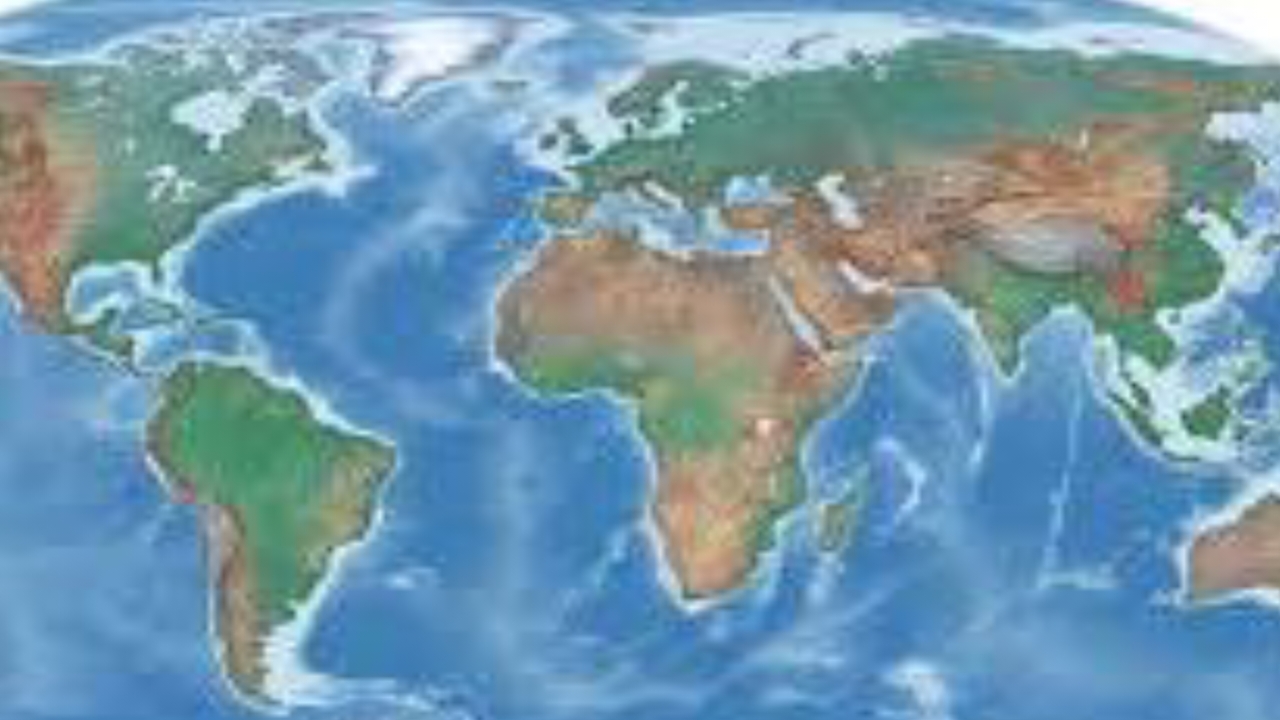
Many widely used world maps are not as accurate as they appear, largely due to the limitations of projecting a spherical Earth onto a flat surface.
The most common example is the Mercator projection, a mapping method introduced in 1569 that remains popular in classrooms, atlases, and online platforms.
While it preserves direction and shape for navigation, it significantly distorts size, especially near the poles.
As a result, regions like Greenland and Alaska appear far larger than they truly are, misleading viewers about the real proportions of continents and countries.
The distortion occurs because flattening a globe onto a rectangular surface requires stretching certain areas.
In the Mercator projection, this stretching becomes extreme as you move away from the equator.
For instance, Greenland may look comparable in size to Africa, when in reality Africa is about 14 times larger.
Similarly, Alaska can appear almost as large as Brazil, despite Brazil being several times bigger in actual landmass.
These visual inaccuracies can shape misconceptions about geography, global importance, and even political influence.
Cartographers and scientists have long acknowledged these limitations, leading to the development of alternative projections such as the Peters projection and Robinson projection, which aim to balance size and shape more realistically.
However, no flat map can perfectly represent the Earth without some form of distortion.
The only truly accurate representation would be a life-sized, spherical model—essentially a globe.
Understanding how map projections work is essential for interpreting global data correctly.
As digital mapping continues to evolve, experts are encouraging greater awareness of these distortions to ensure people view the world with a more informed perspective.
Now, you know.
National News